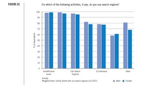
Sometimes it does take a few words to explain a picture. The following graph was in some research published by iCrossing. I'm still trying to figure out what the least prevalent activity is among both genders. My guess is that in the desire to make the chart look nice on the page, some selective editing was applied. However, it has made the chart only partially useful. The objective of graphics is to portray all the relevant information in an easily consumed method. This one fails the test.


No comments:
Post a Comment