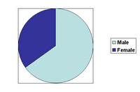
I recently had the opportunity to review a customer profile analysis. The two basic questions were:
1. How do my customers differ from the general audience?
2. Are there differences across our brands?
I suppose that the results would help provide input and insight into all types of issues -- branding, promotion, creative, etc.
For each demographic variable, there were five pages that looked like the above. Points:
1. There was no summary answer to the questions.
2. It took much longer to review than necessary.
3. It was boring, making it even more difficult to answer the questions.
4. No added value since I don't consider converting a table to a chart a valuable service.
Unfortunately the analyst (or was it just someone used to working with desktop tools) missed the objective of the exercise entirely, which is to help us understand and provide guidance. A stack of charts doesn't cut it.
When preparing a presentation, reorganize material to fit the needs of the audience, rather than replicate the data crunching process. I would have liked to have seen two pages:
a. Comparison of customers to the general audience; highlighting where they differ.
b. Comparison across products; again pointing out differences in profiles.
The human brain, and hence the mind, is capable of absorbing a lot more than we give it credit for. Check out discussions and sites on 'visualization' starting with Stephen Few's "Perceptual Edge."
Finally, when presenting results be sure to answer the questions that funded the work in the first place.


No comments:
Post a Comment